KEY TAKEAWAYS
-
Well-designed landing pages can be a vital tool in attracting new customers, converting their initial excitement into sales or leads, and if all goes well, repeat clients.
-
For an effective landing page that converts, first pick a target audience.
-
Decide what kind of landing page to design – lead generation or purchase driven.
-
Evaluate your sales funnel and determine how you want to drive traffic to your landing page.
-
When considering design of your landing page, keep in mind clarity of content, a streamlined flow, and a clear CTA.
-
Once your landing page is live, ensure you monitor, AB test, and optimize for even more conversions.
When it comes to generating more sales for your business, how do you convert visitors into returning customers? How do you make sure that your website has the right features to maximize your sales output/numbers and generate ROI?
Well-designed landing pages can be a vital tool in attracting new customers, converting their initial excitement into sales, and if all goes well, repeat clients.
Companies that use between 10-15 landing pages usually see a 55% increase in sales leads.
Check out the following guidelines to help you craft an impactful landing page that stands out from the deluge of commercial ads.
Why use a landing page?
Landing pages are sections of your website that live separately from the main site, where your customers “land,” in order to showcase one targeted focus or point that you want to drive home.
Landing pages are good for…
-
capturing email addresses and information
-
promoting a product
-
offering a discount
-
inviting people to an event
-
any number of other business targets
Landing pages – when properly utilized – direct users to your call-to-action (CTA), hopefully driving your visitors to convert that lead or sale. But before you begin designing your landing page, you should consider a few vital tips.
You can check out our white paper landing page here.
Before anything else, do some research and …
1. Pick a target audience.
Don’t try to be everything to everyone. Targeting your pages correctly can increase the conversion up to 300%.
When you narrow down your audience, you can better and more strategically design your landing page to the needs of that particular audience. And that will increase your likelihood of your visitors staying on the page after the first impression, thereby improving your chances of conversion.
By establishing the target personas, you can identify their desired content. Different personas will require different designs, so gear your landing page specifically for a desired audience. You can always create more landing pages later. Do not go crazy at first. Start simple.
2. What kind of page are you creating?
Decide on the objective for your landing page.
Are you trying to achieve too many things at once? Have you decided the business goal for each particular landing page? By designing your website from the goal backwards, it allows you to ensure your content matches your target. Landing pages with multiple offers get 266% fewer leads than single offer pages. So stay focused.
Some designers, in trying to add lots of fancy, colorful graphics to set their websites apart from the competition, also create more distractions. Make sure that you don’t lose visitors’ attention and that all roads lead to your single objective.
Landing pages can serve many functions, but most commonly, landing pages are created to drive leads or to sell products or services.
Decide what kind of landing page you are going to create first.
Purchase-driven landing pages are used to provide users with information about your product, service, offering, or brand. They are focused on driving sales for that specific product.
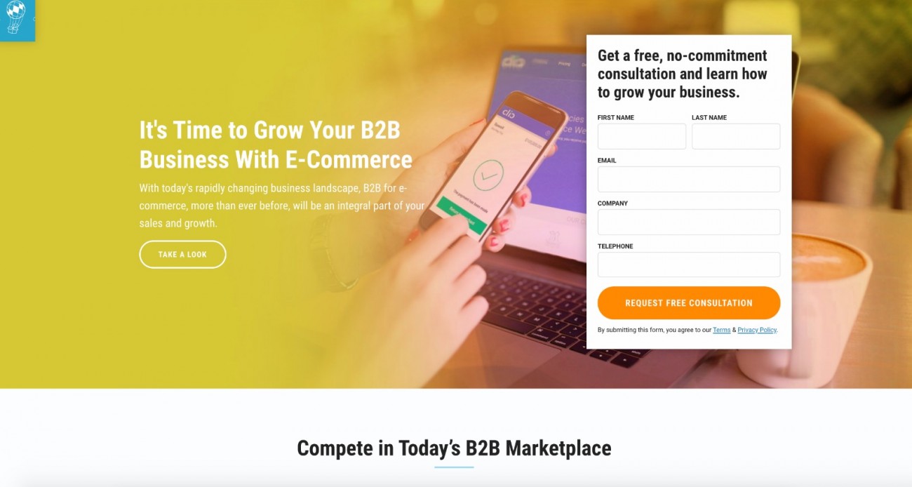
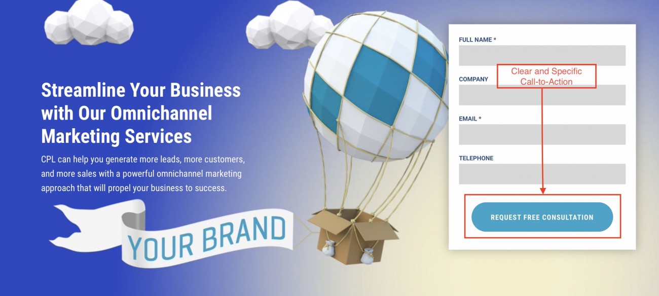
Lead-generation driven or lead-capture landing pages are often referred to as Squeeze pages. The purpose of lead capture landing pages is to gather the visitor’s personal data, usually their name and email address. These pages usually have no exit path from the page, no links or navigation – only a CTA button to submit the requested details.
As you see in the sample below from one of our landing pages, there are no distracting links except for the obvious CTA.
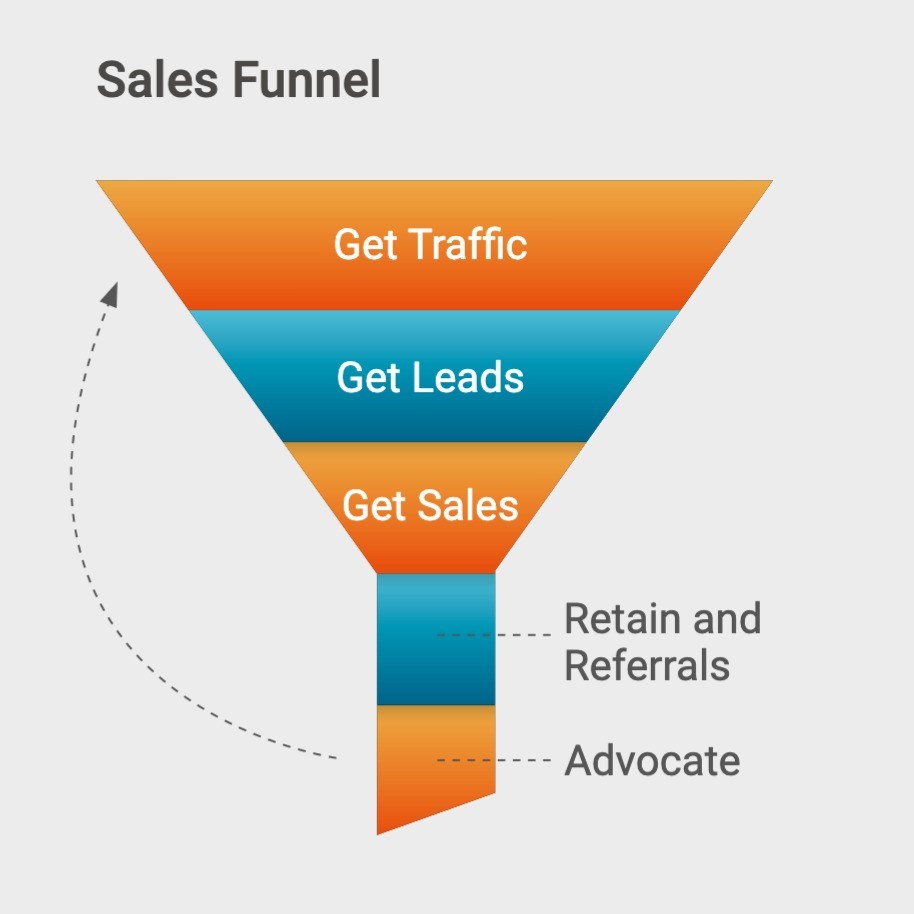
3. Decide how to drive traffic to your landing page.
When designing your marketing strategy, you need to keep in mind your sales funnel and buyer journey to guide the decisions behind using each channel and link in the chain.
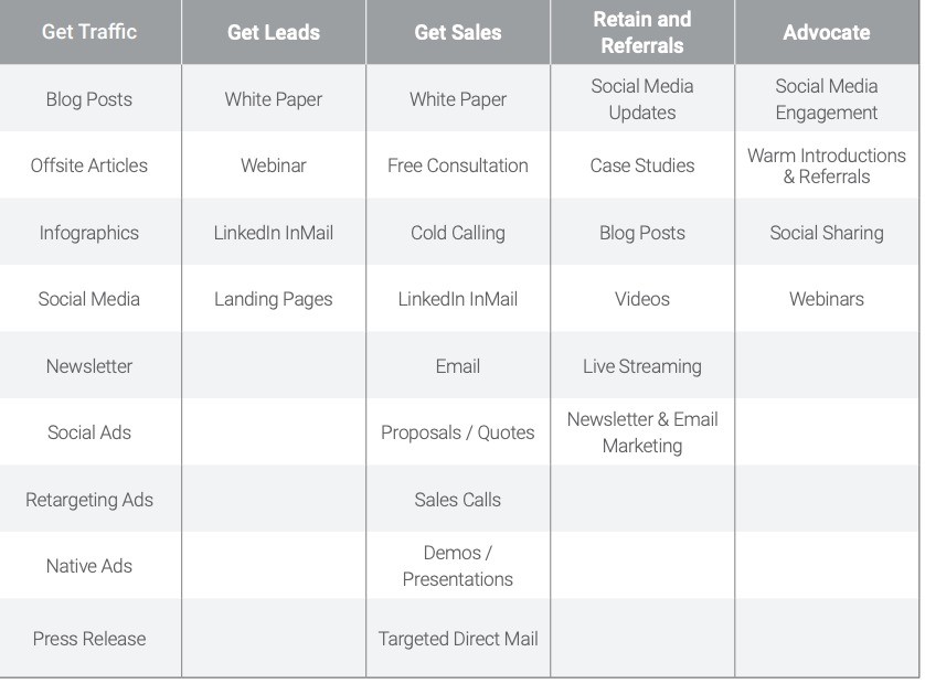
The table below outlines a typical suggested buyer’s journey for businesses. When considering overall marketing strategy, keeping the buyer’s journey in mind will help your team better understand how to push traffic, generate sales, and drive conversions.
As you can see, Landing Pages play a big role in the funnel for driving conversions.
Consider the digital channels you will use to drive traffic to your landing page. The target audience and purpose behind your landing page should help inform these decisions and drive your strategy. According to Hubspot, 61% of online marketers say generating traffic and leads is their biggest challenge.
Will you use social media, like Facebook, to run ads to your landing page? Write press releases? How will you lead the target audience to this landing page curated specifically for them?
Visitors can be directed to a landing page from a number of locations:
-
Organic traffic
-
Google AdWords or Bing Ads
-
Paid social media
-
Print advertising
-
Social media
-
Native ads
-
TV commercial
-
Press releases
-
Medium
-
Sponsored/third party articles
-
And other traditional marketing
4. Design the perfect honey trap.
Craft your landing page in a way that captures and keeps visitor attention on target.
Quickly deliver a great design.
What does that really mean? “Great design” seems ambiguous. What it really means is to get the information across clearly, get your page to load fast, add a colorful and obvious CTA. This is what it means to possess great design in business.
Bold and catchy headlines will instantly capture attention. However, not too distracting either. Setting up that first glance that piques interest and generates curiosity is integral to achieving your objectives. If your website is too clunky and hard to follow, you will lose new visitors faster than good content will keep them. By creating a streamlined, functional web page where users can find information quickly and efficiently, you increase viewers’ time on your site and the likelihood that it will convert.
First impressions are really important, so make sure you take the time to structure your website around creating a good one.
The design of your page will vary depending on whether the goal is to generate leads or sales, but ensure that you have streamlined the page towards meeting that end goal. Visitors should be led to that goal easily, without fuss.
Organize, organize, organize – get your information across clearly.
When someone clicks on your landing page, it should be easy to find the information they are seeking. An easy way to achieve this is to add simple headlines that direct guests to pertinent information you deem important on this page. Subheadings are also a proven method for helping visitors navigate your content. Don’t have busy navigation headers or links on the sides that can distract visitors from your end goal – your conversion. Wordstream reports that removing the navigation menu can increase conversions by 100%.
Be clear in the content of your headings and subheadings, so visitors can locate the information quickly and efficiently. And don’t be afraid to use bullets or consistent patterns, so users can travel the page with ease.
Add some visual content that captivates (videos).
By adding multimedia elements like videos to your landing page, you can definitely increase traffic to your landing page. According to Wordstream, using videos on landing pages can increase conversions by more than 80%. However, make sure to do so selectively, so you do not take away from the main focus. Also, bear in mind that attention spans are not long, so make sure your video can get to the point in a reasonable amount of time.
Carefully selecting quality, relevant graphics and images will help your landing page stand out from the competition. However, too many stimuli can draw the viewer’s eye away from the page’s content or CTA button. So be sure that it is engaging without being distracting.
A/B testing the colors and page placement of these features can help you determine the best move for your unique landing page. How will you know? Using A/B testing can help you evaluate which decisions generate the most results, including color schemes, image location, form placement, and many others. You will read more about this later.
If the goal of your landing page is to direct customers to complete an action at the bottom of the page, then adding too many links in the header, footer, or sides of the landing page can often lead traffic away from your objective. You will garner more conversions this way, funneling them to your CTA.
Content with actual answers.
Eye-catching headlines, wonderful graphics… but if your landing page still does not provide the answers that viewers are seeking, not only will you lose their attention, you will also lose their respect for your site. If your advertisement, email, or landing page promises something, your content should deliver accordingly.
By establishing a reputation for your business as a company that consistently delivers on customer expectations, you will continue to generate quality traffic and sales.
By knowing your customers, you can be sure to emphasize the priorities important to them. This could mean emphasizing the value of your provided service over the cost. If cost is the main driving factor, then low price or discounts might be a better tactic to motivate visitors to click on your CTA.
Make sure your landing page loads quickly.
As mobile networks continue to thrive and wired networks take a back seat, business implications will change and companies should be prepared to take the necessary steps to stay on the cutting edge of today’s ever-evolving technological advancements.
Without super fast download speeds, you risk losing customers – and sales – due to a lagging and lacking user experience. 2018 research by Google shows that 53% of mobile users leave a website that takes longer than three seconds to load.
So ensure that your landing page and website are always on par with loading speed, or you risk losing the majority of impatient visitors who live on the internet (and on mobile view).
Creating an eye-catching CTA above the fold will drive more conversions.
The main focus of your entire landing page is your call-to-action, where the actual conversion happens. This could be to sign up for a service, buy a product, submit information, or any number of items.
Don’t be afraid to be specific in your directions. If you expect customers to do something, be clear.
Ensure that your CTA button or link is easy to locate, so that visitors do not have to actively search for it. Reduce the chances that they will overlook it on your page by choosing colors that highlight it on your page.
Don’t be afraid to change the language on the actual CTA button or link to reflect more appealing lures. Some have found that natural language does better here than prefabricated lines like “Sign Up Now.”
You can check out the characteristics of high-converting CTA buttons here.
Make sure that when visitors actually complete the task you have set out for them, this should generate a Thank You page or pop-up, showing your appreciation for their action. It is important to validate the customer and make them feel understood. You can even pair this with discounts on a future purchase.
Remember:
-
It is much easier to see on a streamlined page, if you’ve reduced your links to a few target items that help drive your point home.
-
If you want to make your CTA a little more visually appealing, it can even be embedded in a video.
Improve your honey trap.
There are many convenient apps and strategies out there that will dramatically improve your landing page design, enhancing the look and feel of your page. And don’t forget to ensure your copy has the right tone for your target audience.
Pop-ups
Using exit pop-ups can help increase conversions by giving visitors one last chance to convert before moving on to the next website. It works even better on mobile devices. One tool that can help you with these is Privy.
Privy
Privy features a suite of email capture and conversion tools, including exit-intent driven website pop ups and banners to help you grow your email list, reduce cart abandonment and drive sales from your website or online store, without any coding or development skills necessary. Privy Email gives small businesses all of the basics they need for effective email marketing for e-commerce like newsletters, abandoned cart emails, and order follow up emails.

OptinMonster
OptinMonster is the lead-generation plugin for WordPress that allows you to create and integrate highly effective email signup forms on your website, from soome of the most popular email service providers like Constant Contact, Aweber, MailChimp, and more.
Timers or Countdown Clocks
Using a countdown clock is very effective in that it creates a sense of urgency. If you look at Amazon’s, they create the importance of completing the sale faster by estimating the Order by This Time located right near the Add to Cart button. It can be used for other purposes too. Neil Patel experienced 11% more conversions by adding a countdown timer to his training seminar offers.
5. Once you have everything, turn on the engine, optimize, and watch the conversions roll in.
How do you turn it on? Slowly. Don’t turn all your traffic channels on at once. It will take anywhere from a month to three months to really ramp up a good in-bound campaign. You might get results faster but to really get it going, it takes longer.
Optimize your landing page.
How do you optimize? Do AB testing. Look at your traffic. See what works and what does not work based on the results of your reporting.
Are you pulling in different segments than you intended? Maybe you want to design and target different groups than the ones you were successful in reaching. Reevaluate and redesign your strategy around that. For your e-commerce, you may want to do a campaign focused more towards women and one towards men. Is your focus on the wrong product? Is it at the wrong price point?
Using a tool like HotJar, you can do heat mapping and understand page visitor behavior. HotJar is a behavior analytics and user feedback service that helps you understand the behavior of your website users and get their feedback through tools such as heat maps, session recordings, and surveys. See where they are hovering the most on your page. Where are they spending time, what are they avoiding, and what is not working in your page layout. Refine, retune, AB test, see what users are doing, and start segmenting more, if your campaign is working well.
Convert more mobile users.
Today’s world is a digital one in which most people access the internet – and all things – via their smartphones. According to Adobe, companies with mobile-optimized sites triple their chances of increasing the mobile conversion rate to 5% or above.
You’ve done all of this work to get the interested customer to you only to lose them. How? Your website does not function well on a mobile interface.
This is one huge mistake that many sites do not consider when creating a strong, engaging landing page that converts. Instead, give website visitors access to all that your landing page has to offer from anywhere in the world, whether in front of a computer screen, or most likely, on a mobile phone. If your website can’t operate in the smartphone age, you will quickly be left behind.
From smartphones to voice search, current trends are easier to keep up with than you might think.
Optimize your marketing strategy for voice search.
Keep track of your CRO.
How will you know which strategies can help your business generate more sales?
Educate yourself on the different tools available to measure conversion rates. Try different strategies to determine the appropriate route and trends for your specific industry and business model. A/B testing and other rate calculators can help in learning which elements make the most sense for your landing page.
After you have done all of this work, you will still need to keep your content current and on trend. You can do this with the help of a number of the aforementioned useful tools and strategies that make generating and maintaining quality traffic to your landing pages consistent.
Ultimately, don’t be afraid to test out different landing page styles, so you can locate the right colors, layout, and CTA button that work best to drive conversions on your landing page.
For more tips on how to build a successful website, visit 10 Crucial Elements Every Website Should Have.
Ensure that any e-commerce is secure.
If your landing page is geared towards sales, then you need to be more concerned with the information transacted on that page. Identity theft has become a huge issue for many cardholders in an evolving omnichannel world. When purchasing on a website, consumers want to know that their financial and personal information is safe. Ensuring that your website aligns with security expectations will take your website one step further than the competition.
Use an e-commerce hosting site like Shopify or KCart with a 24/7 operational web host with a good backup service, in case you ever need to restore it. You can also purchase an SSL certificate from a recognized vendor and move your website to HTTPS. This creates a secure link for users between their browsers and your servers to prevent security hacks. Bonus: it will help Google to give you a higher SERP ranking.
It is also important that you avoid storing sensitive data like credit card information on your website. To avoid this, you can use processes like Tokenization, which substitutes customer information for “tokens” or unique identification data online, reducing risks and providing more peace of mind for your buyers.