KEY TAKEAWAYS:
-
Choosing a sensible domain name, good hosting and security, a modern design, fresh and consistent content, and good mobile usability are critical.
-
The most important and often most neglected aspect of website design is a strong and compelling call-to-action, followed by a value proposition, the “why” of the action in the form of a benefit to your potential customer.
-
Create a prominent navigation menu with clearly displayed items and an easy-to-find contact form should be included on every page of your site, along with a conspicuous link to your contact form.
-
Put a row of icons that link to your social media pages somewhere on every page.
-
For content creation, posts should be of value to customers and adhere to high readability standards while showing your expertise in your field.
-
Build trust on your website by providing evidence that your customers are happy with your products and services.
There are a number of crucially important website elements that should be included in any business site in order to maximize effectiveness and provide a positive return on your website investment.
There are some overarching best practices that all businesses should keep in mind when developing a website, such as having a sensible domain name, good hosting and security, a nice, modern design, fresh content on a regular basis, good mobile usability, etc. We won’t go into those here, but they certainly cannot be ignored when developing your site.
There also some elements that are required by law, such as privacy policy, terms of service, copyright info, etc. We won’t get into those either since we’re focusing on marketing elements.
We've compiled a list for you of ten of the most crucial website elements with which any good developer that’s worth their salt should be intimately familiar.
You may come up with some exceptions to these rules under unique circumstances, but if there’s no really good reason to omit one of these items, don’t, as it could impact the effectiveness of your site.
Call-to-Action
We’re putting this one first because it’s simultaneously the most important and the most neglected aspect of website design. It’s one thing to hand someone a brochure and walk away. It’s another thing altogether to hand someone a brochure and then invite them to engage in a process that will lead to a sale.
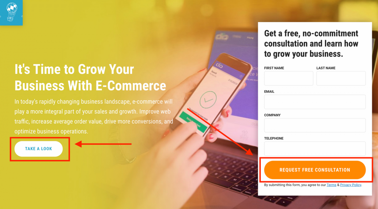
Clear CTA buttons, like this one featured on a CPL landing page, draw the visitor eye to the button, increasing the likelihood of conversion.
This could be as simple as “watch our video demo” or “sign up for free.” In fact, there should be a call to action at every step of the prospect’s discovery process. When the video is over it should tell the viewer what to do next. When the client has signed up for free, it should tell them what to do next. Always, everywhere, have some kind of call-to-action or instructions for your audience.
A Value Proposition
Tell your audience why they should take action. Using the above examples, the video could say something like, “Watch this short video to see our product in action.” For a premium signup it could say, “Start taking advantage of our features today.” The idea is to provide more than just a call-to-action, but also the “why” of the action in the form of a benefit to your potential customer.
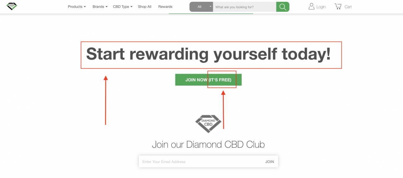
Diamond CBD does this by providing the value proposition twice. First, they state the benefit upfront and immediately following it through with a CTA button that provides a secondary incentive.
Clear and Strategic Navigation
There are a handful of elements that visitors look for right away. Some look for the “About” page. Some look for a contact form. Some want to see your blog.
Make a list of the pages that your particular audience might be looking for and make a prominent navigation menu with those items displayed clearly. Menu items can also be grouped into dropdown menus to keep things clean and organized. Navigation can also include category teasers.
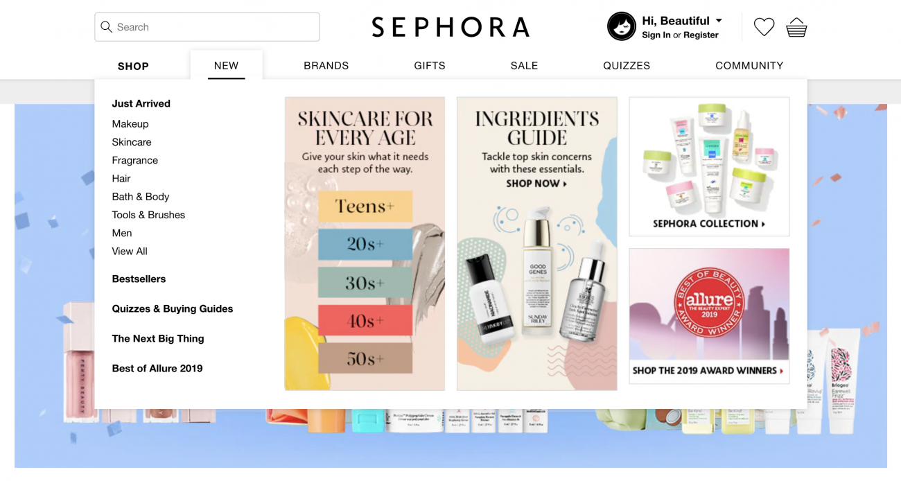
Category teasers, like these from Sephora, pique the interest of website visitors, increasing the click through rate.
It’s a good idea to sit down next to some people who are not familiar with your business and watch where they go. Have them tell you out loud about what they are looking for. For example, imagine a tree nursery website.
When shoppers land on this website, they’re not looking for you to tell them why you’re so great, how you’ve been in business forever, how you’ve got acres and acres of trees, and so on. They’re looking for hedges, shade trees, fruit trees, and so on—categories.
Another way to get insights into what your audience is engaging with is through the use of heat mapping tools such as Hotjar or Crazy Egg. These analytic tools provide visual representation of the sections and therefore content of your website receiving the most engagement.
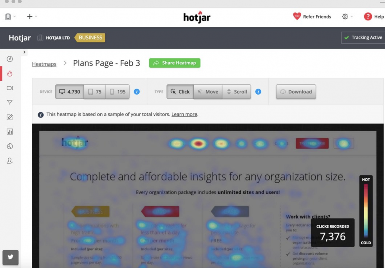
This heat map from Hotjar shows the areas of the website where visitors show more engagement.
A color-coded interpretation lets you see your “hot sections,” that is, which sections are retaining the most attention and your cooler content, which is generating the least amount of interaction.
Determine what people are looking for when they land on your site and make it not just easy to get to, but put it smack dab in the middle above the fold so they instantly know they are in the right place.
Contact Information
You’d be amazed at how many business websites are missing clear and present contact information and/or a contact form. An easy-to-find contact form or information should be included on every page of your site, along with a conspicuous link to your contact form. If your customers come to you, an address is also vital.
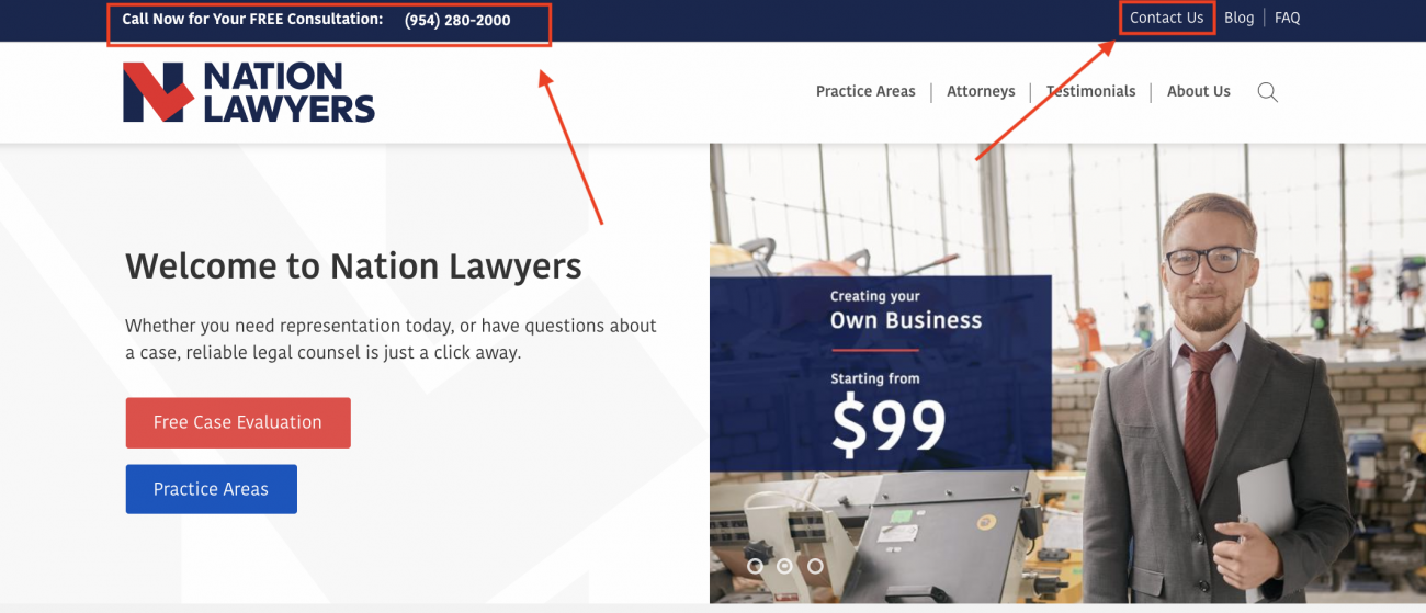
Nation Lawyers website features their contact information in an obvious area, in a bar above their top header and nav menu, making it easy for visitors to find.
Place it in a bar above your top header and nav menu along with an email address or contact form link, and a phone number. Some businesses, such as those that provide software as a service (SaaS) don’t want people calling them every time they have a question, and so will leave out a phone number. At the very least, put some information or a link to your contact form in the footer.
Links to Social Networks
The vast majority of web traffic today happens on social networks. That not only includes sites such as Linkedin, Facebook, and Twitter, but also media sites such as YouTube and Instagram. Put a row of icons that link to your social media pages somewhere on every page, either at the top bar, in the footer, or down the side.
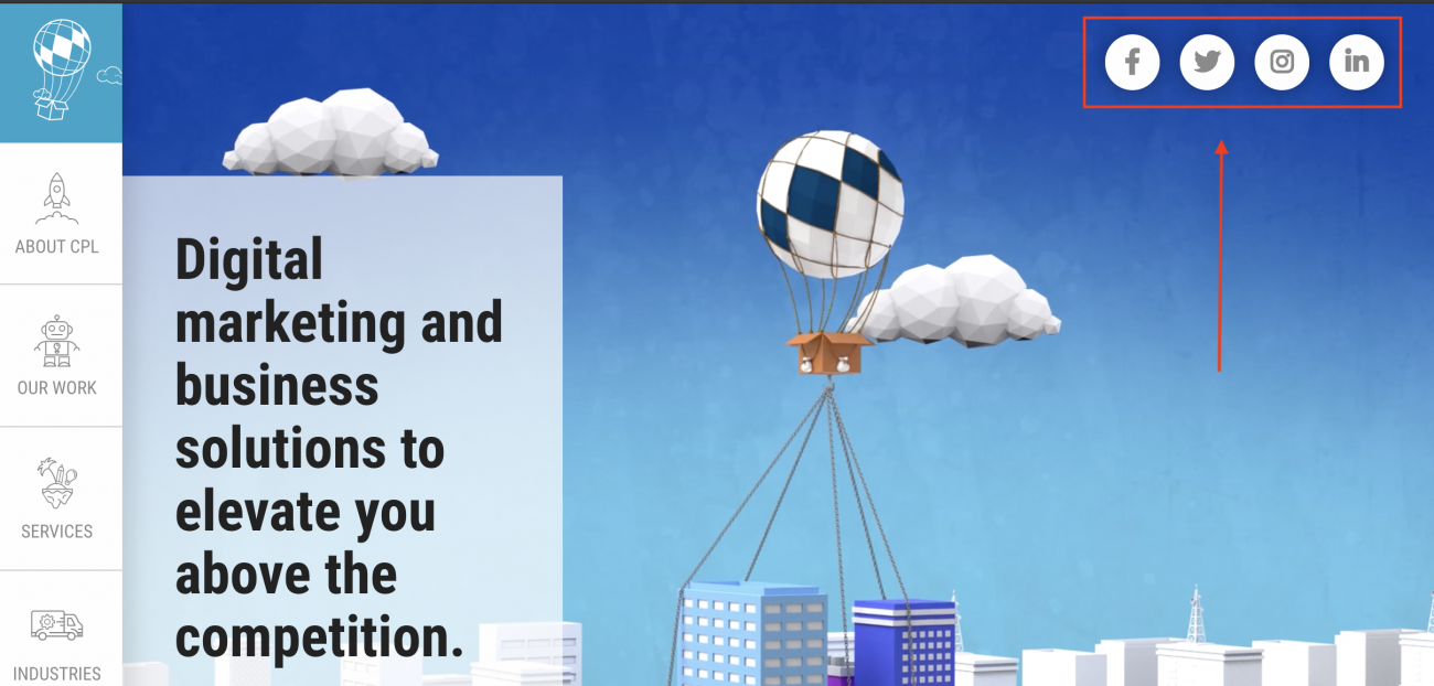
The Creative Propulsion Labs website features all relevant social media links at the top in the site header.
Even more vital are share links that allow your visitors to share your content on their own social media channels or embed it on their website. It’s literally free advertising and can be great for SEO.
Blog/News Highlights
Every website should regularly be adding new content. That doesn’t mean you have to go nuts and publish a blog post every single day. Once a week is recommended. Encourage visitors to view fresh content and subscribe to it by highlighting it on your homepage.
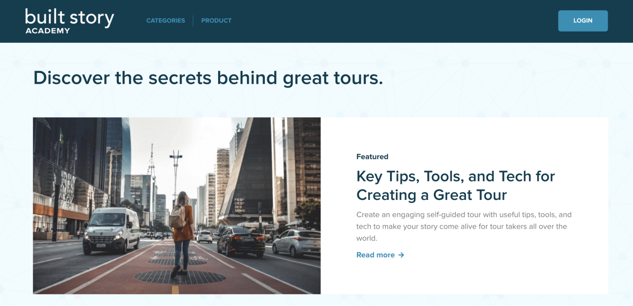
Built Story features fresh tips and strategies for tour guides and creators on their blog page.
It’s no longer a good strategy to post willy-nilly just to cram keywords onto your site. Google sees right through pretty much all black hat methods, and they are getting better at it every day. Today it’s all about the visitor experience. Posts should be of value to customers and adhere to high readability standards while showing your expertise in your field.
Trust Elements
One of the most important elements of a website, be it a service company or a product line, are elements that build trust. People are wary of being victims of bait and switch tricks, price gouging, etc.
They want to know that you are a trustworthy company before they take a chance on you. They want what’s called “social proof.” That means that you are providing evidence that your customers are happy with your products and services.
Trust elements include things like BBB A+ icon, industry association icons, testimonials, links to review sites, awards, certifications, etc. Also, if you offer guarantees and warranties, spell them out right up front! Don’t make them small print items at the bottom of a product or service page.
Video
The importance of video today cannot be overstated. More than half of the traffic on the web goes to video content. People have short attention spans. They don’t want to go looking for information, and pages of text are not appealing.
A short informational video on your homepage gives visitors immediate gratification. Keep the initial videos to a couple or three minutes and then direct them to more comprehensive videos.
Videos don’t have to have Hollywood budgets. People today understand that everyone has a webcam or a smartphone and are fine with no-budget videos. In fact, having an introductory video that’s too slick can be a turnoff to some.
Make sure your video features people talking directly to and about the viewer, and not just a bunch of product images, features, and benefits. People want to do business with people, not companies. Talk to them.
High-Quality Original Images
Having real images of your company, your facilities, your staff, etc. can go a long way to building credibility for your business. A good example is hosting company websites. These days, there are hundreds of thousands of them, and the vast majority use stock photos. Stock photos don’t build credibility. In fact, they make visitors question whether or not your company actually exists, or is just a facade.
Email Capture
Mailing lists are and always have been one of the most valuable marketing assets. It costs good money to create a lead or land a customer. To let them slip away after a visit or a sale is sinful. Post-sale engagement is a must if you want to increase the lifetime value of a customer.
Wrapping it up
There are other important website elements as well, but the ones listed here are paramount to your website’s effectiveness as a sale tool.
It’s always a good idea to have a team of professionals working on your website so that you can reap the benefits of their experience. We’d love to help you with your website. Give us a call to discuss your concerns at (305) 763 4110.
You might also be interested in: 5 Tips for Creating a Landing Page that Converts


