Web design style sets the undertone of what your audience will experience when interacting with your web project. Used effectively and strategically, the correct design can propel quicker adoption and improved usability. This article highlights a few of the commonly used UI design styles and some proven strategies for each.
So you are ready to launch a new website or application, or perhaps you’re revamping an existing application. You might have specific pain points in mind that you want to mitigate or avoid. One thing is for sure, user experience will make or break your adoption moving forward. One aspect of user experience is the design style.
Flat
Flat design has been either fiercely loved or hated by its critics since it was conceived. The criticism has been that using only flat elements (devoid of any gradients, highlights or shadows) was confusing to the eye and did not give viewers enough visual clues about how to interact with the interface. Even so, successful applications like Asana and product focused companies like Apple have successfully utilized flat or flat 2.0 design.
In terms of application design, the key is always usability. In Asana, UI all elements are completely flat, and despite the assumed risks, the adoption curve for most teams is very minimal. They effectively use bright, flat colors to highlight key messages or features, and subdue every other aspect of the design with understated borders and light grey text for inactive items. They are generally very minimalist, which gives the whole app a certain ‘Zen’.

Skeuomorphic
A clear mark of skeuomorphism is taking a traditionally ‘real-world’ functional item, like a wooden shelf or a flashlight, and designing that into a fully functional application design. Skeuomorphism can be really helpful and impactful when bringing conventional products into online for the first time.
When Nook and Kindle launched their first full color e-readers, the homescreen which stored all your books was designed as a bookshelf, with all your book covers facing you.
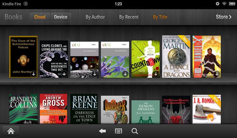
When you wanted to read a book you did the same thing as usual, you looked at your bookshelf, and picked the book you wanted to read. This is a great concept, as these companies needed to design an interface that readers of all ages could inherently understand. By leveraging most readers’ lifetime of shopping bookshelves and libraries, they were able to enhance adoption of e-readers to audiences that were considered less tech-savvy.
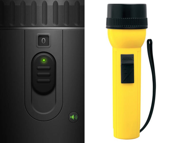
Another great example of a self explanatory skeuomorphic design is the flashlight app. It’s functions are designed with a simple on and off switch just as any traditional flashlight, meaning you can get started using the app without reading even one word. The design is based on a persons prior experience with real world flashlights.
Realism
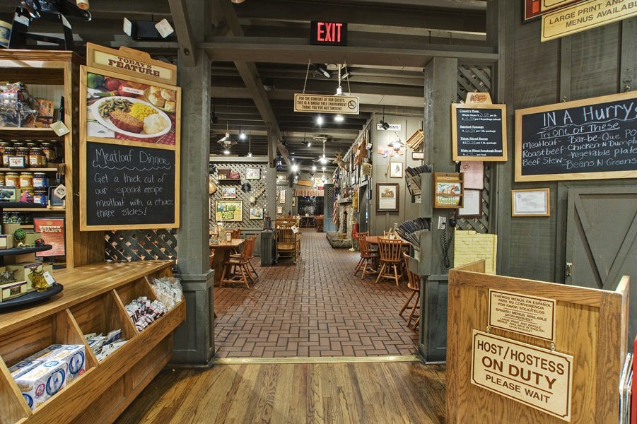
Not to be confused with the very functional skeuomorphism, realism incorporates highly aesthetic, yet photo-realistic elements to create a specific experience. For example, “Cracker Barrel” the “Old Country Store” uses realism elements in its website to communicate the company’s old country culture through the use of wooden textures and retro style typography.
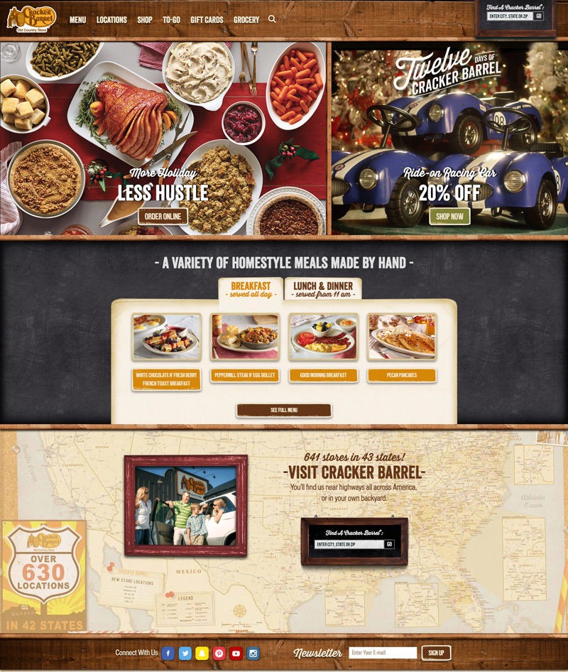
The combination of photorealistic textures to frame the menu, and chalkboard textures to accentuate featured panels is deceptively strategic. These treatments allow their website to preface what your experience might be like when you walk into an actual restaurant. This means from the moment you visit their website you are being taken on a cohesive brand journey.
Photographic
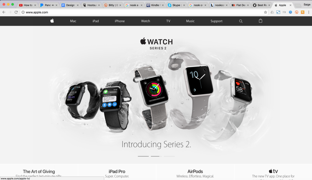
Apple combines flat minimalism with subtle animation effects to enhance high quality product renderings or photography. The result is that the product is the most ‘real’ thing on the page. This keeps visitors focused on the product learning experience, and builds a connection with the physical product, allowing the website interface to take a back seat to this experience.
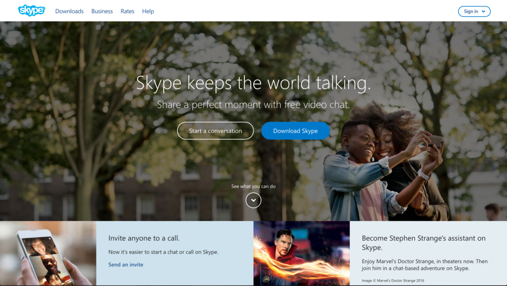
‘Skype’ brings a totally different flavor to a still successful photographic design. Skype doesn't sell a 'physical' product - but they combine concise effective messaging with photography that showcases quality of life with their software services and features. Rather than showcasing flat product UI’s, they are showcasing realistic human experiences through strategic photographic elements which incorporate their app.
